When it comes to home staging, color is a powerful tool that can influence how buyers perceive a property. The right color choices can evoke positive emotions, create a sense of space, and highlight a home’s best features. Understanding color psychology and its impact on buyers is key to crafting spaces that sell. Let’s explore how different colors work in home staging and how to use them effectively.
The Role of Color Psychology in Home Staging
Color psychology is the study of how colors affect human emotions and behavior. In real estate, it’s used to create environments that feel welcoming, spacious, and emotionally appealing to potential buyers. The goal is to strike a balance between universal appeal and a sense of character, ensuring that buyers can envision themselves living in the space.
Neutral Tones: The Foundation of Staging
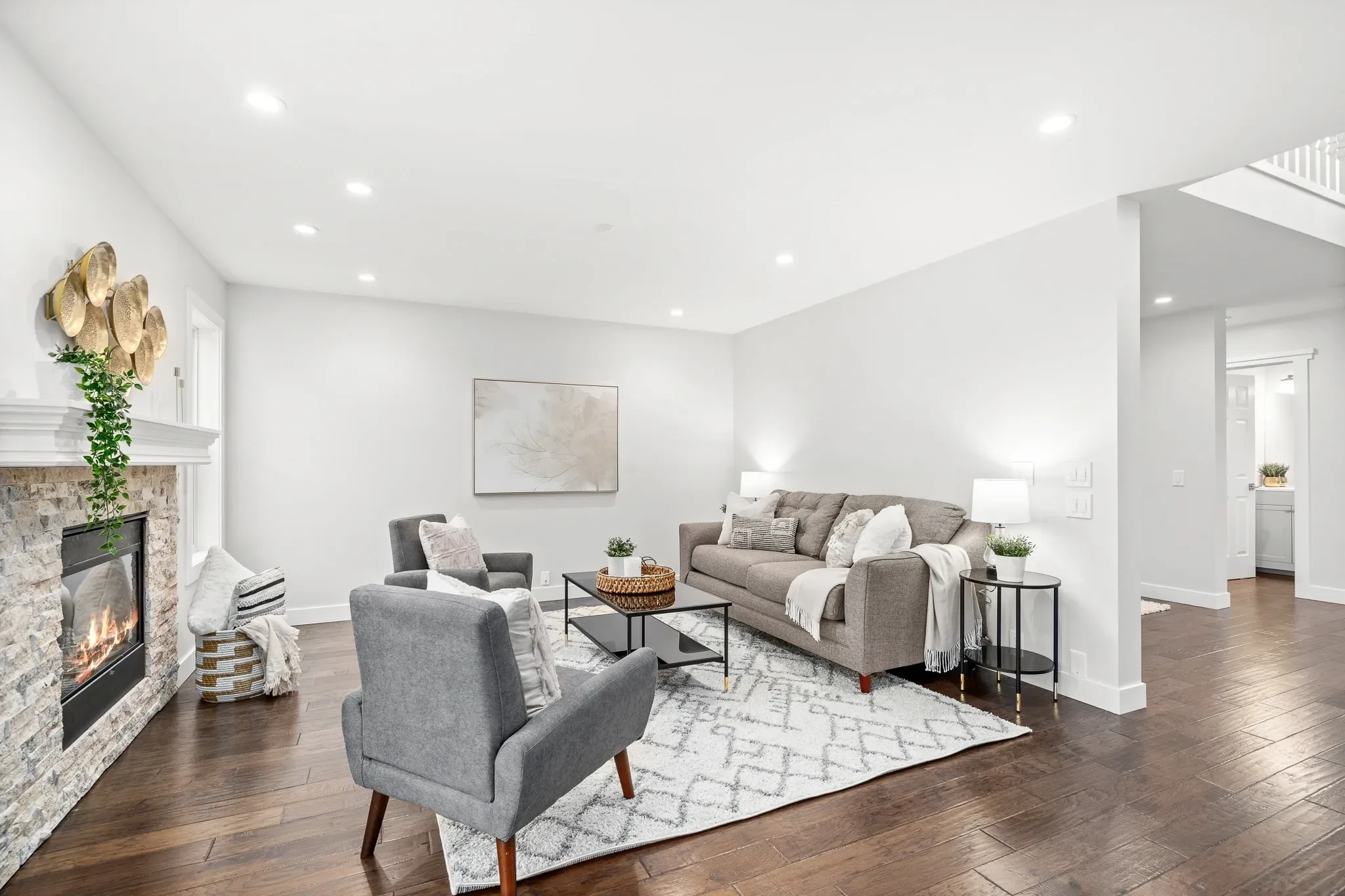
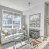
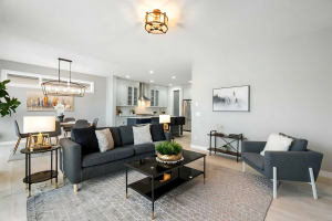
Neutral colors are the backbone of home staging. They provide a clean, versatile canvas that appeals to a wide range of buyers. Here’s how neutrals can boost buyer appeal:
- Beige and Taupe: These warm, earthy tones create a sense of comfort and coziness. They’re ideal for living rooms and bedrooms where relaxation is key.
- Gray: A modern and sophisticated choice, gray adds depth and elegance without overpowering a room. It’s particularly effective in kitchens and bathrooms.
- White: Crisp and clean, white walls make spaces feel open and bright. It’s perfect for smaller rooms or areas that lack natural light.
Neutral tones not only make spaces feel larger and more inviting but also allow buyers to focus on the home’s features rather than its decor.
Accent Colors: Adding Personality and Warmth
While neutrals create the foundation, accent colors add character and interest. Used sparingly, they can draw attention to specific features or create a mood. Consider these options:
- Blue: A calming color, blue is great for bedrooms and bathrooms. Light shades create a serene atmosphere, while deeper blues add sophistication.
- Green: Symbolizing nature and renewal, green works well in kitchens and living rooms. It pairs beautifully with natural materials like wood and stone.
- Yellow: Cheerful and uplifting, yellow is ideal for accenting kitchens or entryways. It conveys warmth and optimism.
- Soft Pink or Coral: These tones bring a touch of elegance and warmth to bedrooms or sitting areas without overwhelming the space.
Accent colors can be introduced through throw pillows, artwork, rugs, and decorative accessories. The key is to use them strategically to complement the room’s overall palette.
Room-by-Room Color Strategies
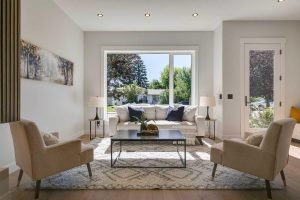
1. Living Room:
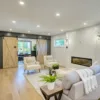
The living room should feel inviting and versatile. Neutral walls with soft accents in blue, green, or gray create a comfortable and stylish space. Add texture through throw blankets and cushions to enhance warmth.
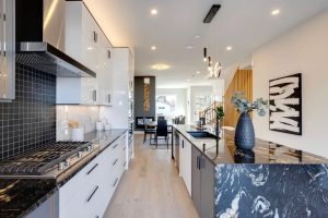
2. Kitchen:
Bright and clean kitchens are a big selling point. White or light gray walls paired with accents in green or yellow can make the space feel fresh and functional. Consider adding a bowl of fresh fruit or a vase of flowers for a pop of color.
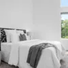
3. Bedrooms:
Bedrooms should evoke relaxation. Light blues, soft grays, or muted greens create a serene atmosphere. Layer neutral bedding with a subtle accent color in the pillows or a throw blanket.
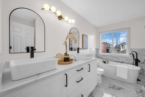
4. Bathrooms:
Bathrooms benefit from clean, refreshing tones. Whites, light blues, or soft greens paired with plush towels and a touch of greenery can give the space a spa-like feel.
5. Exterior:
Curb appeal starts with color. A neutral exterior with a bold front door in red, navy blue, or charcoal gray makes a strong first impression. Pair this with well-maintained landscaping to complete the look.
Avoiding Common Color Mistakes
While color can enhance a property’s appeal, it’s important to avoid mistakes that may turn buyers away:
- Too Many Bold Colors: Overwhelming buyers with bold or clashing colors can make a home feel chaotic. Stick to a cohesive palette.
- Personal Preferences: Highly personalized color choices, such as bright pink walls or unusual patterns, can make it harder for buyers to imagine themselves in the space.
- Ignoring Trends: While you don’t need to follow every trend, staying aware of popular color schemes can make your property feel up-to-date and desirable.


Leave a reply